Additional ggplot things..
Patchwork
Patchwork is the easiest way to combine ggplot objects.
plot1 <- dat %>%
  ggplot(aes(lifeExp, gdpPercap, colour = continent)) +
  geom_point(alpha = 0.5) +
  scale_y_continuous(trans = "log10")

plot1


Adding plots with + puts them side by side

dividing plots with /puts them beneath each other
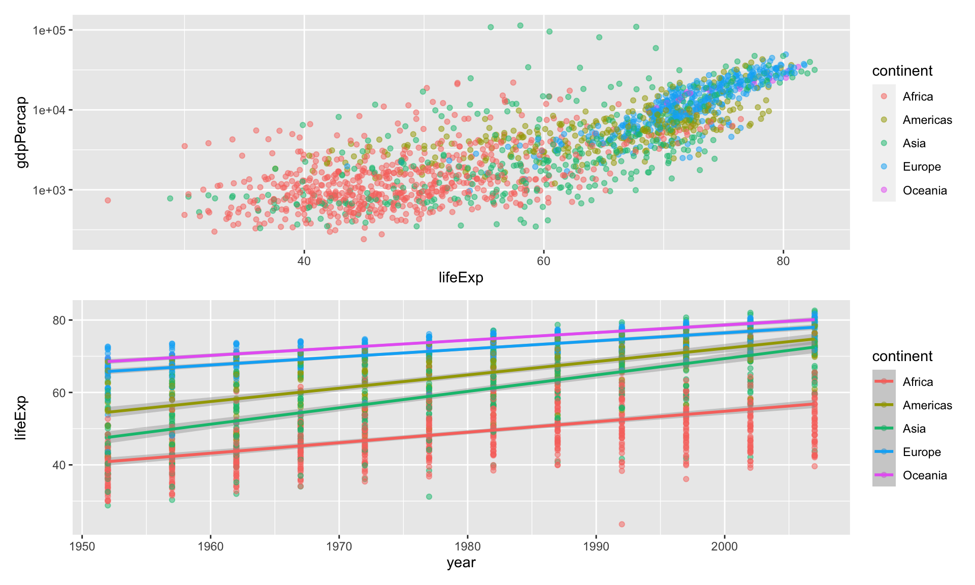
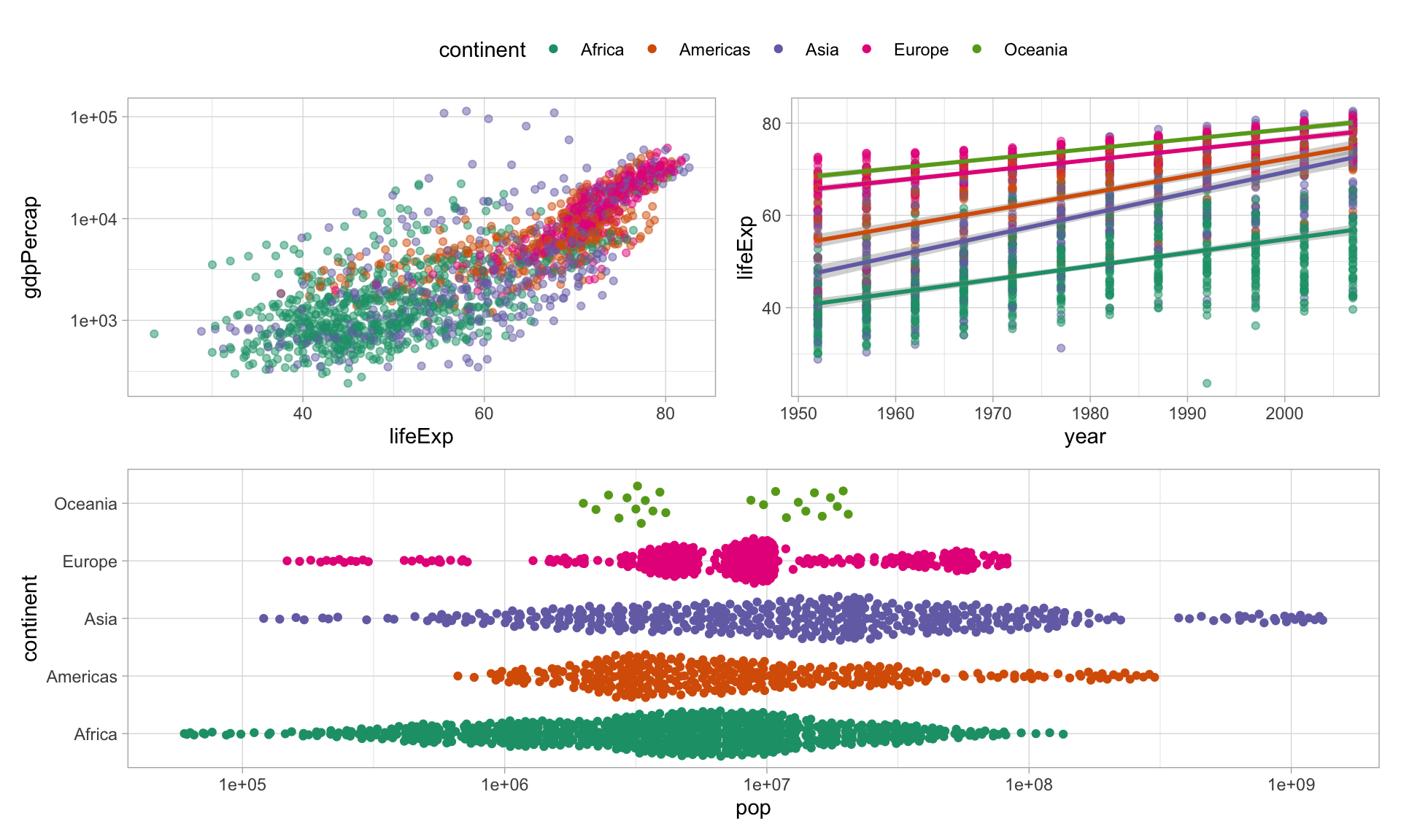
Create groups of plots by using parentheses:
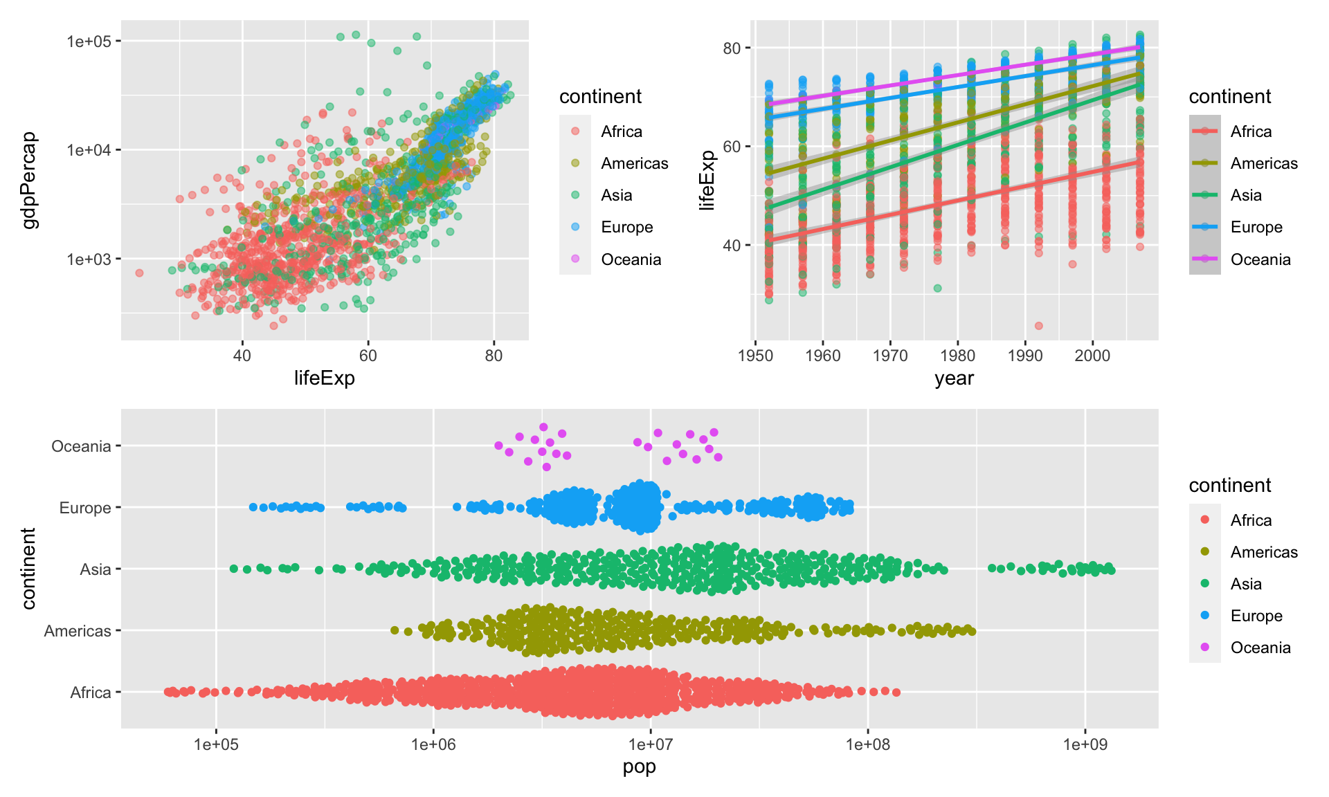
This is nice, but we need to a few more things

Try again, with just one legend
You can do global changes to all ggplot elements using the & operator
Finally, control layouts and add annotations
combined_plots +
  plot_layout(guides = "collect",
              heights = c(0.6, 0.4)) +
  plot_annotation(
    title = "This is already a pretty neat arrangement",
    subtitle = "Wow, look at them plots",
    caption = "Your APA ready caption goes here..",
    tag_levels = "A",
    tag_prefix = "(",
    tag_suffix = ")"
  ) &
  theme_light() &
  theme(legend.position = "bottom",
        plot.caption = element_text(hjust=0)) &
  scale_fill_brewer(palette = "Dark2") &
scale_colour_brewer(palette = "Dark2") 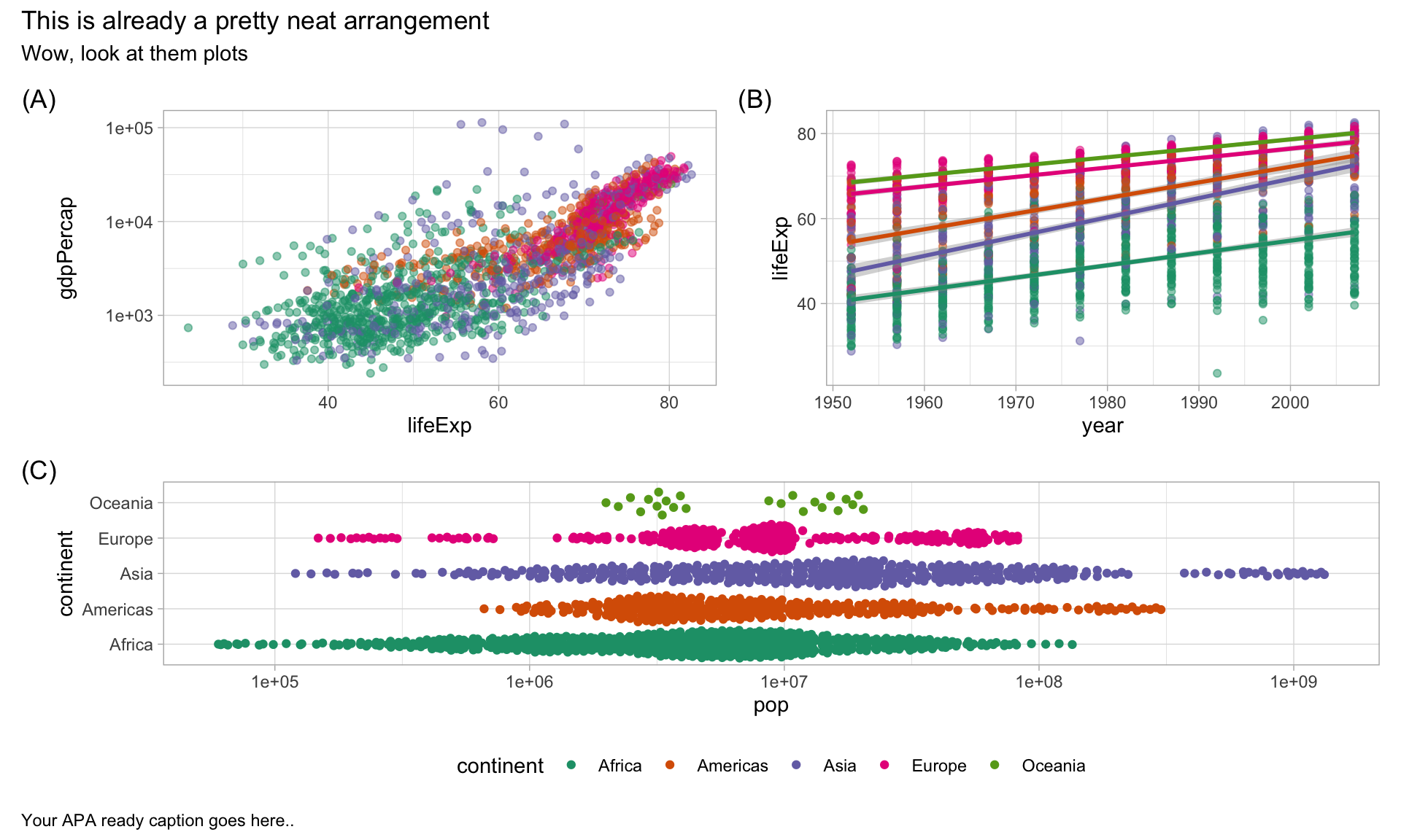
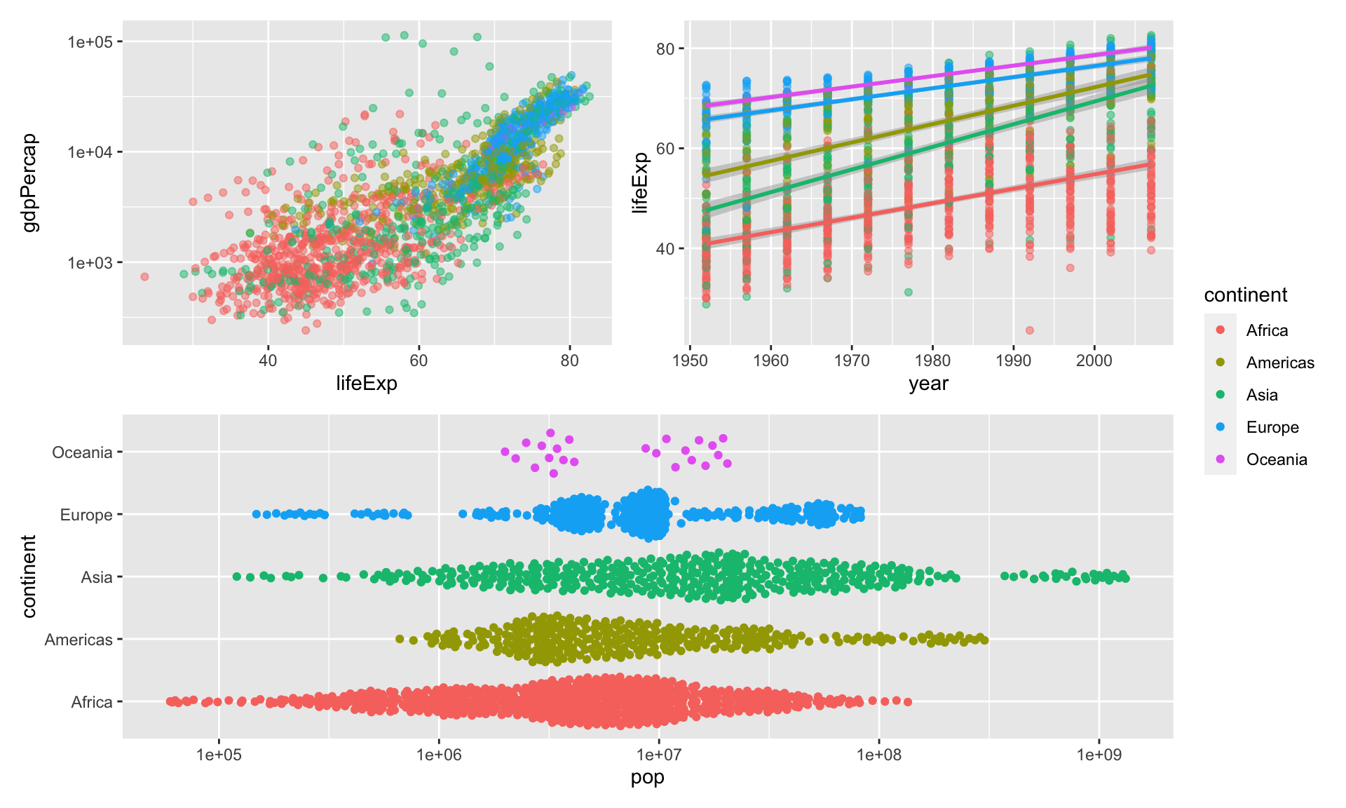
Patchwork can also inset plots
plot3 <- plot3 +
  guides(colour = "none") +
  labs(y = "") +
  scale_x_log10(labels = scales::label_log(),
                name = "Population")

plot1 +
  # get the legend back in
  guides(colour = "legend") +

  # make some room
  coord_cartesian(xlim = c(15, 90),
                  ylim = c(150,1e6)) +

  # inset the plot
  inset_element(
    plot3,
    left = 0.01,
    right = 0.45,
    top = 0.99,
    bottom = 0.45
    )  &
  theme_bw() &
  theme(legend.position = "bottom",
        plot.caption = element_text(hjust=0)) &
  scale_fill_brewer(palette = "Dark2") &
scale_colour_brewer(palette = "Dark2") 
Raincloud Plots
I love raincloud plots, so I have to shout them out here! They are unfortunately a bit tricky to create, and only work for some data types (real continuous data, not likert type data).
But to just give some inspiration.
There’s several ways to create raincloud plots. The easiest is probably via the ggrain package:

But it’s also possible with the ggdist and gghalves packages. See this great blog post by Cedric Scherer
The {ggstatsplot} package
{ggstatsplot} is amazing for plotting relatively simple tests (t-tests, ANOVA, simple correlations).
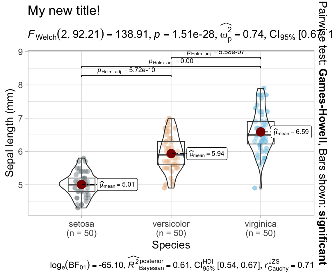
The default can look a bit unwieldy at times, but the plots can be highly customized.
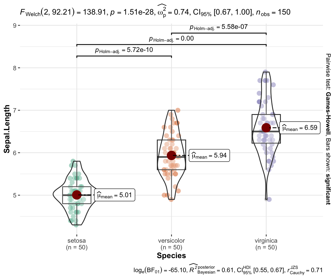
{ggstatsplot} - ANOVA
{ggstatsplot} - Correlation

{ggstatsplot} - model parameters
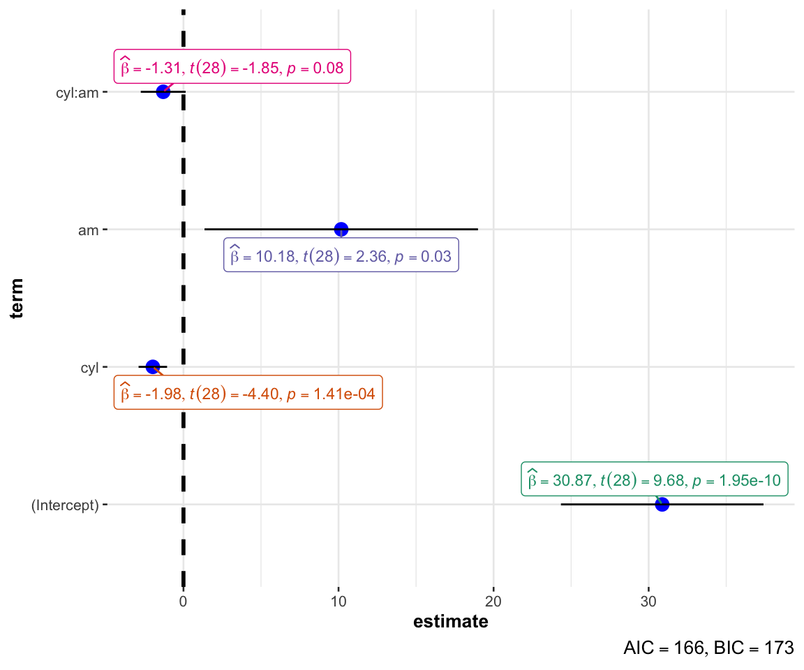
using {ggstatsplot} for model parameters
Not great for more complex models

The {sjPlot} package
sjPlot is an amazing package that is particularly nice for plotting complexer models.

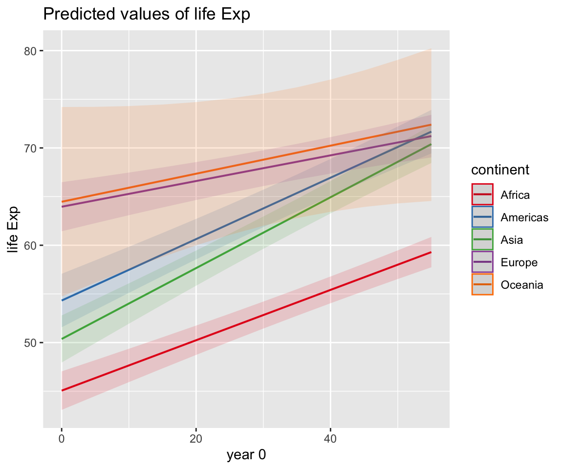
The {sjPlot} package
my_model %>% sjPlot::plot_model(type = "pred", terms = c("year0", "continent")) +
  scale_x_continuous(labels = \(x) x + 1952) +
  theme_light() +
  theme(legend.position = "top") +
  labs(x = "year",
       y = "Life Expectancy",
       title = "Predicted life expectancy for different continents",
       subtitle = "Model: lifeExp ~ gdpPercap_log + year0 * continent + (1 + year0 | country)")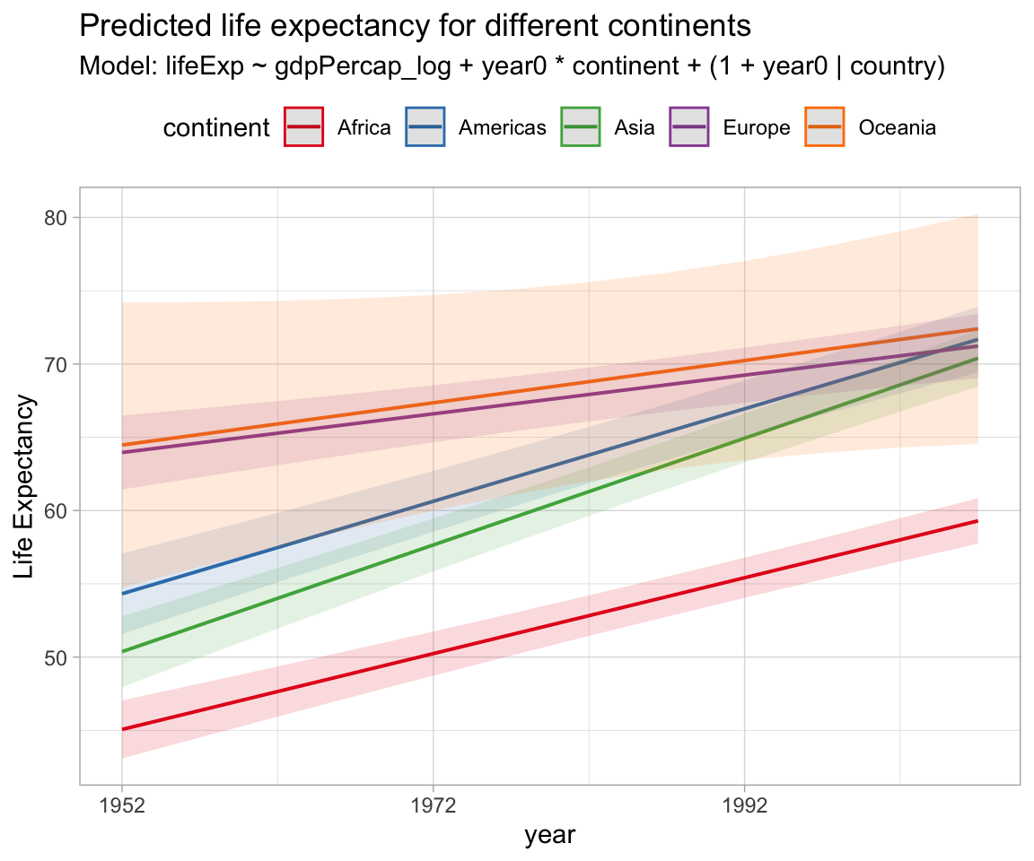
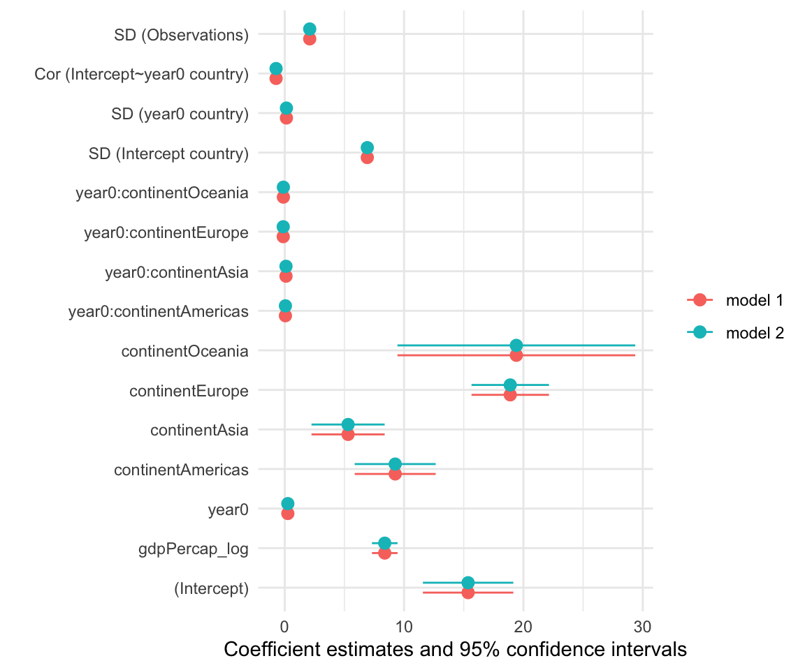
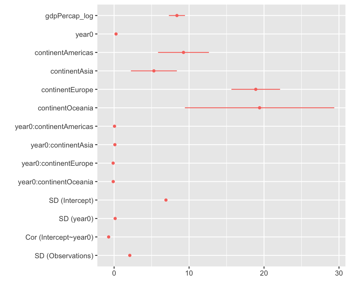
The {Dotwhisker} package
Also used by some people…
Modelsummary
Modelplot from {modelsummary} can produce nice comparison plots from a set of models. Just provide a list of models to compare.